Website

My Blog
 |
| My Blog |
My Favourite Logos!!!
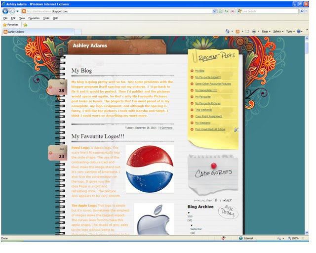
 Pepsi Logo: A classic logo. The wavy line's fit symmetrically into the circle shape. The use of the contrasting colours (red and blue) make the image stand out. It's very patriotic of Americans. I also love the condensation on the logo. It gives you the idea Pepsi is a cold and refreshing drink. The texture also appears to be very smooth.
  The Burger King Logo: This logo clearly shows you that it's Burger King. The colours contrast each other since they are from different sections on the colour wheel. There is a good range from straight to curved lines. The texture is mostly flat, but appears to be smooth. I love how the font "Burger King", is a burger itself with the hamburger buns!
 The WWF Logo: This logo is very affective because of the contrast between the black and white. The simple outline of the panda is more effective than a detailed panda. There is a good range of curved lines. There is also vertical symmetry within the panda's face. The panda represents the whole idea for what WWF stands for. There is no texture in the logo.
Some Other Favourite Pictures
 |
| Sabrina |
I like the angle of this picture. I also like the editting that Sabrina did to make the colour exaggerated.
Reflection. (Online Image) Avaible https://blogger.googleusercontent.com/img/b/R29vZ2xl/AVvXsEio6QvExAyB2juzlhC-GRftQTuFgWpYn40kuoFGBqiCESfFSgD29Oz8xGgKNzl_AwI4pqDBOmK9GNOWkuQUkiIrVV0GCqHtplkaaJ350xjmHrLF1IWGCvhMif_Q71LoIcU0UoVKom7U2oE/s1600/Reflection.jpg 09/23/10
 |
| Cameron, Logan, Ben, Declan |
Silloutte. (Online Image) Availble
https://blogger.googleusercontent.com/img/b/R29vZ2xl/AVvXsEhpXaNXzGd9i16wmz01sKikQwwhln6rJrbZLbdKb1x1xv9Av3lm2YIvxpsWEwZTbF1f9TPKgaNBOeyJQ8VvaQ-lxoh4UcfqcRq88sih09ixX4OGrx_oh63gJ1gQIinIQMKoYbu4y0cpVOM/s1600/silhouette.jpg 09/23/10
 |
| Mystery Person |
My Nameplate !!!!!
My Name Plate:
Background: I used the gradient folds background in the colour pastels. For the texture I used large dots at 27% intensity. The theme is subractive. I sharpened the image twice, created an inner glow around the edge using orange, and saturated the colour to 33%. 
My Name: I put it on the setting colour. I choose the font Copper Std Black in size 52 and bolded it. I choose a bright yellow colour. I used solid shadow in a bright blue to contrast the yellow. I added inner glow to add highlight to the bottom of my name.
My Favourite
My favourite movies are as followed:
Comedy: Step Brothers, Will Farrel is hilarious
Action: Inception, This movie really made you think
Horror: When A Stranger Calls, It's one of the few horror films I've seen
Mystery/Thriller: Scooby Doo, The classic mystery
A trailer for Inception:
My Favourite Pictures
 This is a reflection of Kaesha and I. It was taken by the door at the school.
 Portrait: This is a portrait of Steph and Kaesha from above.
Landscape: This picture was taken at the creek by the school. It's a very beautiful picture of nature.

Close Up: I love this picture because of the contrast between the colour of the leaf and the rest of the picture.

Something man made lost in nature: This picture was taken from on the bridge looking down. We spotted this juice box, and thought it would make a good picture.
 One Colour: This picture emphasizes red...a close up of the fire alarm against the bricks.
Texture: The texture of the bricks is emphasized in this picture. Steph and I are walking away in the background!

A silhouette: This picture is a silhouette/shadow of Steph, Kaesha, and I. We were posing as Egyptians!

Exaggerated Angle: This picture was taken from below a dandelion which is an angle that you don't often see.

Something grown in an environment that shouldn’t be able to: This vine we found was growing on the fence. There is much contrast from the harsh barb wire to the soft leafs.
This weekend:

 movie's to celebrate my freind's 15th birthday. On Sunday my dance school is putting on a production for the Terry fox run. I have to do my solo!
 My Weekend
This weekend my Dad came down from Kamloops. On Saturday morning my Dad and I went to the Jamery. My meal wasn't very good. Later I went home to work on my Science homework, and my Dad went to the artwalk. Apart from that I didn't do much else on Saturday other than hang out at my house. On Sunday we ate out again for lunch but this time my brother Tenessee came. The meal was great!!! Later Sunday night my Mom came home from Sascatchewan. She brought me a bag and a I LOVE REGINA keychain!
First Week Back At School
